 Translate
Using Kit Elements
You’ll find the various UI Kit widgets we’ve rebuilt for Elementor under Metro Lifeboat in the Elementor left column when you’re editing your page.
Sections vs. Widgets
Sections contain one or many widgets. Both sections and widgets can be formatted or given one or more CSS classes to provide preconfigured formatting. There is a section below titled Classes on which may be useful to you.
Adding a Sections and a Widget
If you scroll to the bottom of an Elementor editor page then you will see this:
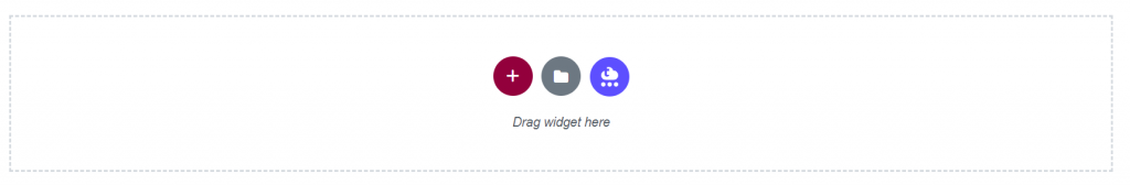
Click on the red plus to get to the columns configuration for a new section. In this case, I want to use a single column:
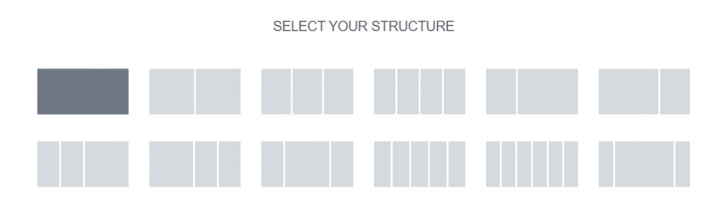
When I mouse over one of the choices and click on the choice for a single column, a section is created with a single column. It is outlined in light blue which can be seen when it is selected or when you hover over a section as you see here:

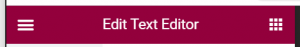
To add a widget to your section, find this red bar in the upper-left of the browser window and click the grid of nine squares in the top-right.
Find your widget under “Elements” by scrolling that left panel.
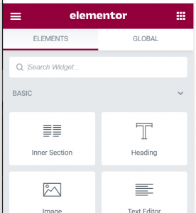
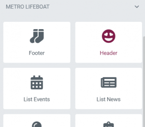
The items we’ve made for Metro based on the UI Kit are found under Metro Lifeboat:
Then click on it and drag it into the section like so:

Classes
There are several classes that can be added to widgets and sections to modify their behavior listed here. To add the classes, select either your widget or section and then in the left panel find the Advanced tab. In there is a box for adding classes here:
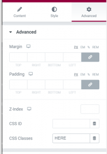
Available classes:
margin-cols or m-cols
used when you have a section with multiple columns to add horizontal margin between them
margin-h or m-h
adds horizontal margin on both desktop and mobile
margin-h-mobile or m-h-m
adds horizontal margin on mobile only
margin-h-desktop or m-h-d
adds horizontal margin on desktop only
margin-v or m-v
adds vertical margin on both desktop and mobile
margin-v-mobile or m-v-m
adds vertical margin on mobile only
margin-v-desktop or m-v-d
adds vertical margin on desktop only
width-full
makes this item the full width of the browser viewport
width-narrow
shrinks the item horizontally a little
We have set up a style section on each of the custom widgets that offers the above classes. They then get transferred to the containing section as necessary.
Using Tables
This site uses TablePress which does not offer an Elementor plugin. Instead, you create a table and then add the shortcode in the Elementor editor. More detailed instructions can be found at https://elementor.com/blog/tablepress/


